A Home Fit for the Art Collector
Sep 20, 2019 | Carpet One Floor & Home
Working with a great art collection is an exciting challenge. There are many homeowners who are adventurous and open, allowing for risks and unexpected design pairings. But at the same time, creating a cohesive interior using an existing color palette requires a unique strategy. It’s tempting to be a complete minimalist, letting the art speak for itself. It’s more fun, however, to play around with different colors, shapes, and textures.
Many of our clients have young children, and designing for families is at the core of what we do. By bridging the gap between high-end luxury and practical living, we design interiors that are comfortably glamorous, yet not too precious. Our Harper client came to us because we specialize in colorful, sophisticated spaces that embody everyday elegance.
This family had a new construction home in the West University area of Houston, which is just west of Rice University, near the heart of the city. The couple loved bold hues and had an impressive art collection to match. They also had four children under the age of four. Our goal was to create a home that honored what they loved, while also capturing the stylishness they desired.
This was the clients’ wish list:
- Embrace jewel tones.
- Include heirloom furniture and artwork
- Use high-performing fabrics and softened edges for the children.
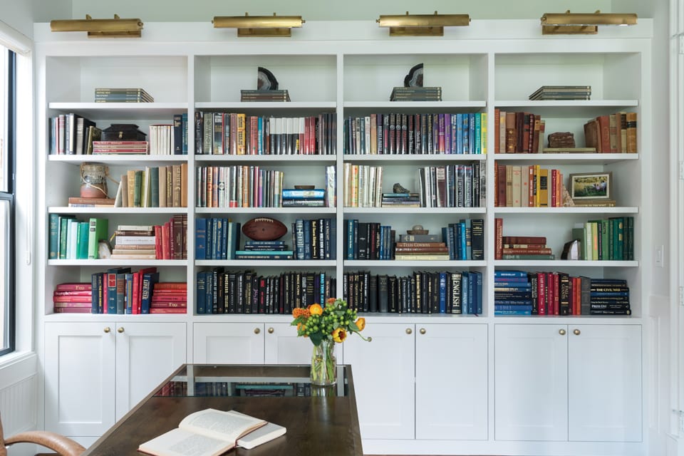
- Create a custom-built display for their rare book collection.
And of course, it was crucial that we worked with their existing art.
We design around great art collections often. It is essential that you choose a paint color that will give the art its own arresting power. The right color isn’t always white! It is also important to consider the shape and finish of the artwork, even the time period. We want all the elements to complement each other without being too matchy-matchy. And finally, in a home where different art pieces mingle, we like a curated feel that incorporates different textures and styles in a layered manner.
Choosing the Right Paint Color
Start with a flat finish. Depending on the artwork, you can work with white, gray, or even light green. What we are trying to achieve is contrast. Over the years we have developed a list of our favorite paint colors that help art pop:
- Dovetail by Sherwin Williams: A classic gray that works as a foil against lighter and softer artwork, like a charcoal drawing on paper
- Alabaster by Sherwin Williams: A serene off-white that works well against moodier paintings
- Simply White by Benjamin Moore: A white with a bit of yellow that works well with warmer-toned interiors
- Great White by Farrow & Ball: A cooler white that works well in blue or greenish spaces
Layering Textures and Shapes
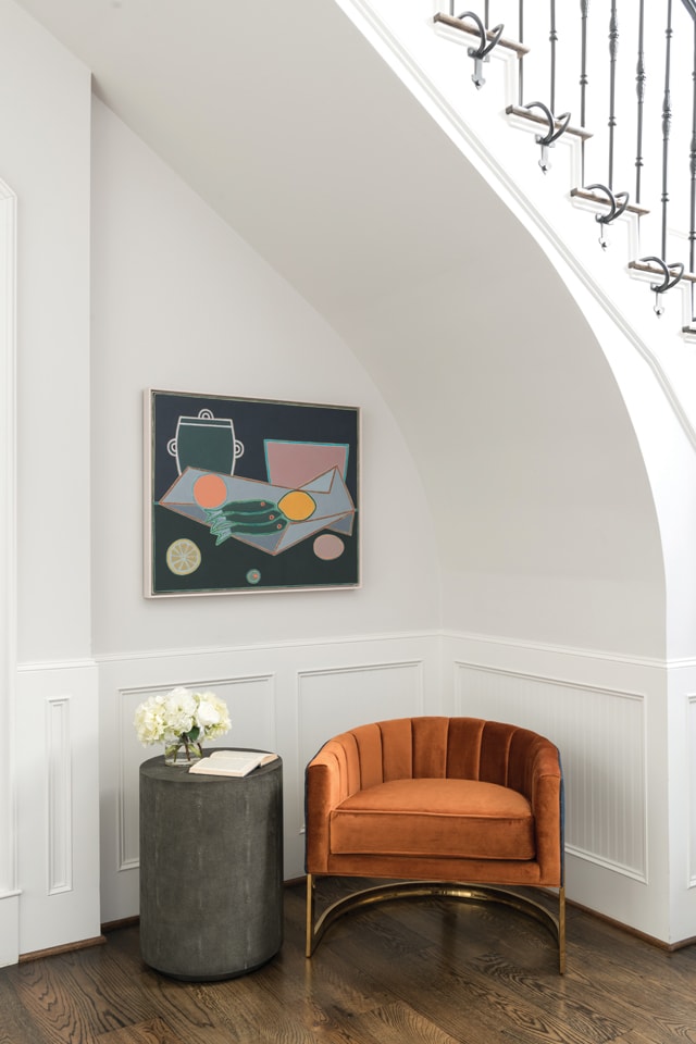
The shape of the entry chair mimics the curve of the staircase in a highly complementary manner. This is intentional. Because the art collection was so varied, we created cohesion through texture and shape. We also sourced new art that would happily marry older styles to new ones.
To make sure the home seemed interconnected, we consulted with the clients’ art advisor, Katherine Bowdoin Barthelme of Bowdoin Projects. Together, we curated a colorful and balancing selection that tells a unique story in every room of the home.
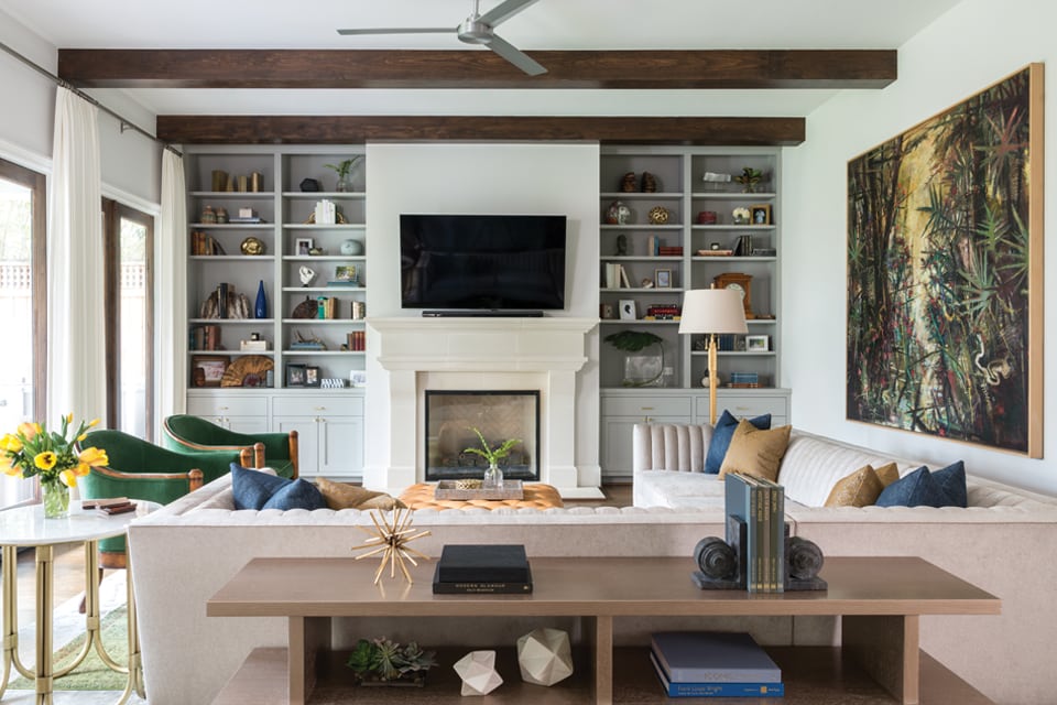
Walking into the living room, you will find organic curves next to orthogonal lines. Too many right angles would have been harsh, so we softened the room with arched chairs and spherical objets d’art. The green chairs are vintage heirlooms from the client’s grandmother that we reupholstered in emerald fabric. The result is vibrant, playing off the jungle-like palette of the art piece above the sectional.
When colors, patterns, and shapes come in pairs, the eye can connect them in a pleasing way. On top of a neutral palette, like gray and cream, the pop of green activates the space. There is a tension between some colors that I find really exciting.
Working With The Home's Architecture and Energy
While art drove the color palette and played an integral role in the design, we also looked to the architecture of the home. Whenever we approach a project, we take the framework as an inspiration. The home was full of character-building details: wainscoting, exposed wood beams, and custom millwork. We felt a distinct mid-century energy that we layered with vintage finds and present-day touches.
Mid-century designs are marked by a familiar orange and turquoise color scheme. We opted for a richer take with jewel tones, like emerald and sapphire, and added rust. Earthy terracotta and cream shades subdued the brighter ones.
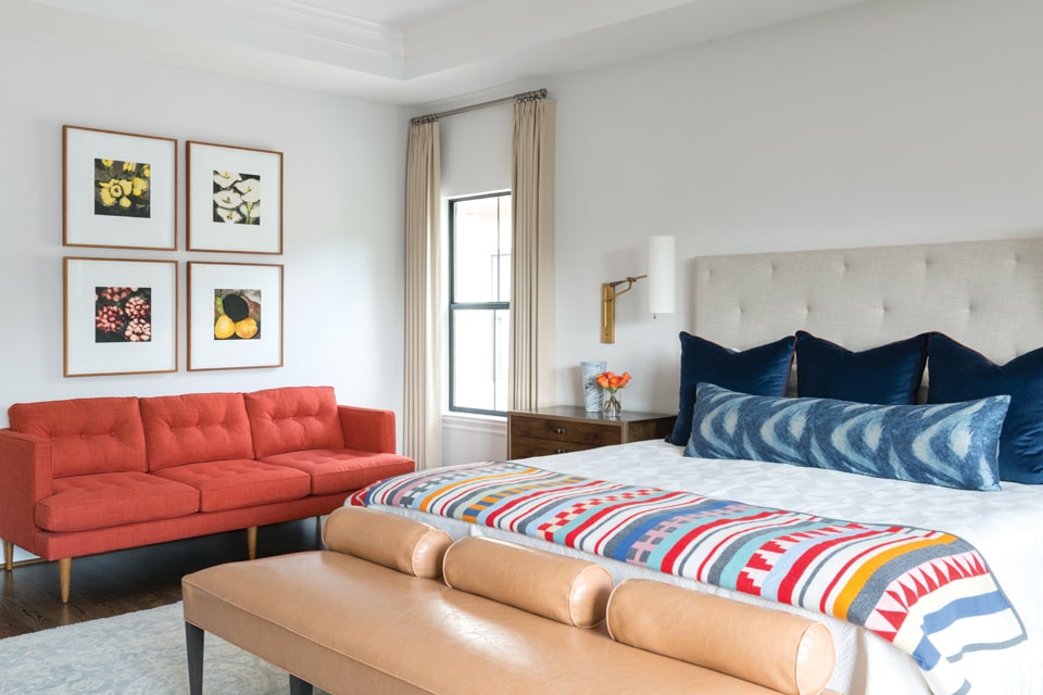
In the master bedroom, we used a more modern and playful take on color. It’s a bit brighter in this room. The red, white, and blue harks back to a classic Americana look that is sophisticated and not kitschy. The gold-finished étagère hosts a collection of poppy colors, family photos, and, again, a clever use of texture and shape. The artwork in this room—four panels featuring flowers—honors the homeowners’ four children.
Opposite this wall are a mid-century desk and chair. The simplicity of the furniture design reflects the architecture of the home in general and gently draws the eye toward the painting above.
Tying It All Together With Vintage Pieces
Perhaps our favorite room in the entire home is the study. Here, the main focus is not the art, necessarily, but the rare book collection. We designed a custom bookcase with special lighting devoted to showing off the colorful spines below.
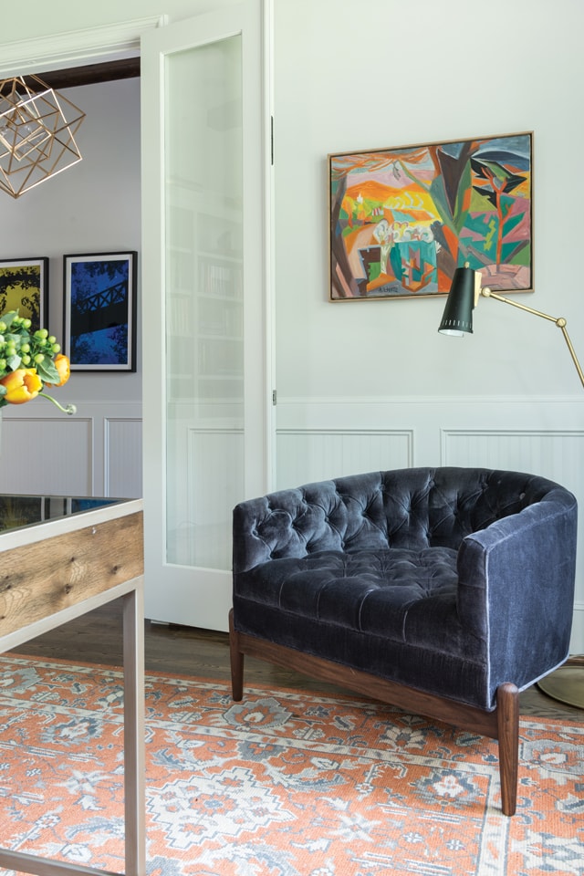
The vibrant blue chair, another Modshop find, is in an art deco style. The Jaipur rug beneath is hand-knotted in an overdyed Turkish style. Several more Turkish rugs throughout the home give it a cohesive look. We should never shy away from combining styles and time periods. When done well, the result is a warm, worldly environment that feels lived-in and loved.
Ensuring Family Friendliness
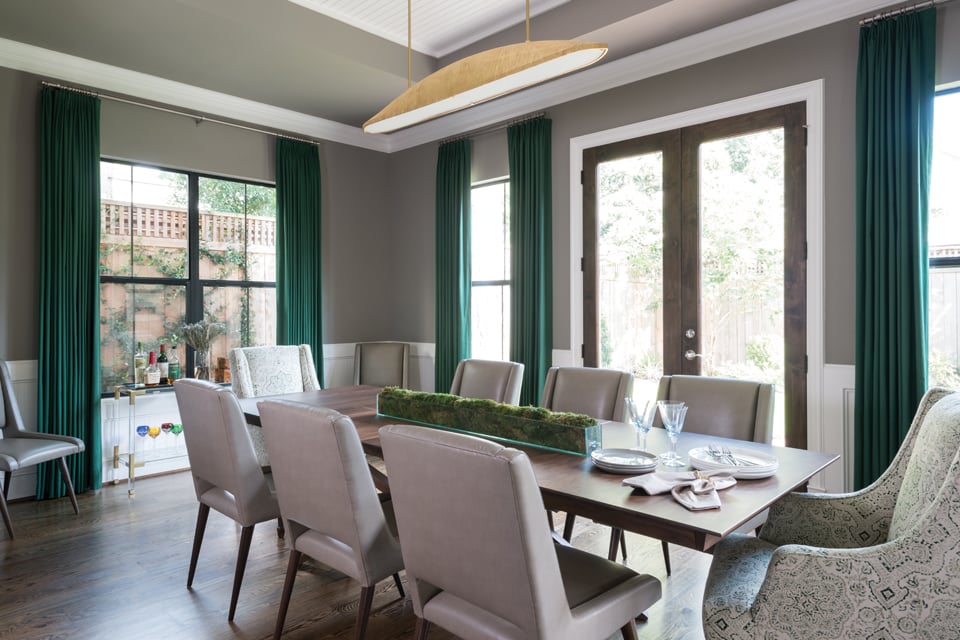
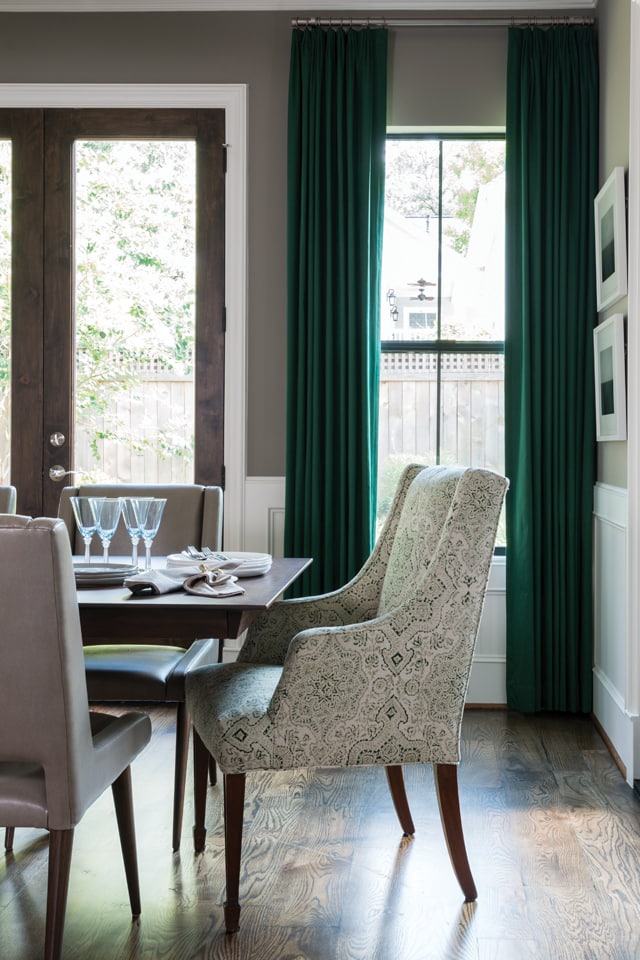
The drapery in the dining room is from Robert Allen in a show-stopping forest shade and is capable of handling water-based cleaners without staining. The color is reminiscent of the floral-themed artwork found throughout the home and serves to pull everything together. It looks great against the green chairs in the living room. When color is a priority, custom upholstery is a must.
We always recommend that clients with young children invest in high-performing fabrics. Having the peace of mind of easy clean-ups makes a home just that much more comfortable. Crypton and Revolution Performance Fabrics offer many pattern and color options, all of which wick away spills quickly.
The clients wanted a sophisticated yet lived-in home that was comfortable for their growing family. They were thrilled at the final reveal! With this intentional backdrop, their home is now ready for whatever new pieces they find on their travels. Collectible art, vintage rugs, bold colors, custom pieces, and a smart layering of reimagined heirlooms make for a unique home.
Laura Umansky is the Founder and Creative Director of Laura U Interior Design. Laura Umansky is an industry leader and top Houston interior designer. Her signature Classically Current aesthetic brings iconic designs of the past into the modern, creating interiors that are warm, luxurious, and elegantly practical. From working with builders and architects to designing custom furnishings with local artisans, Laura leads a talented team that focuses on high-end residential projects around the world.@LauraUInteriorDesign